Looking to start a new project or collaborate with us? We'd love to hear from you.
Project overview
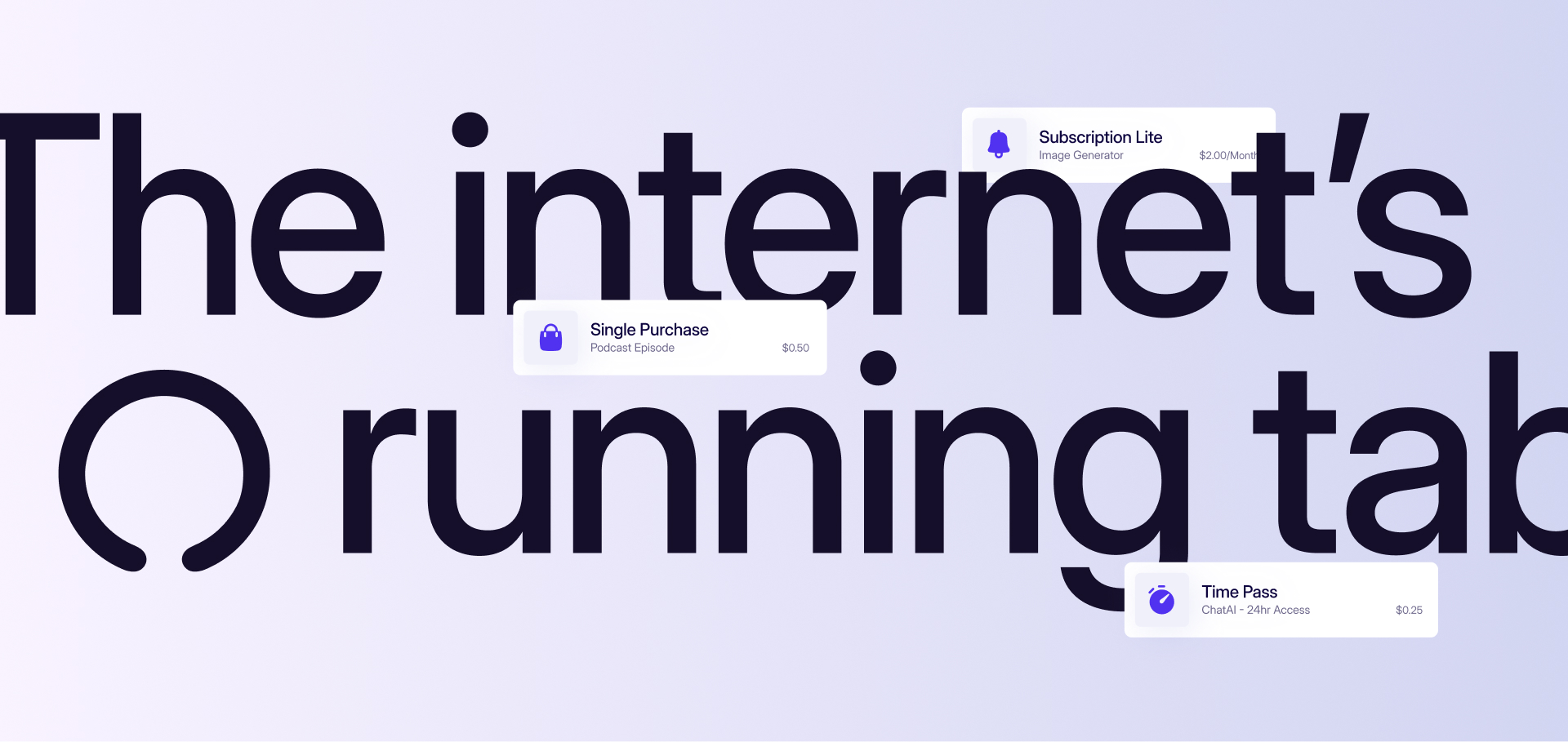
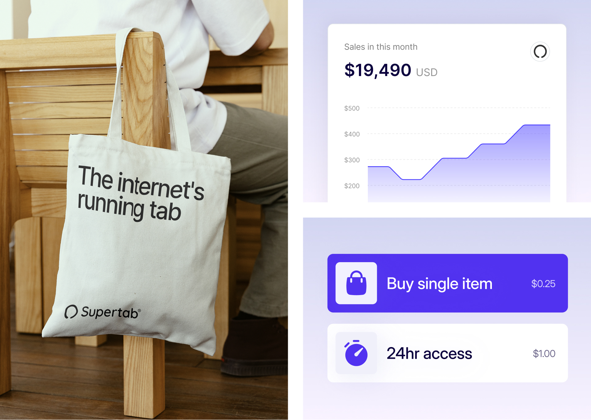
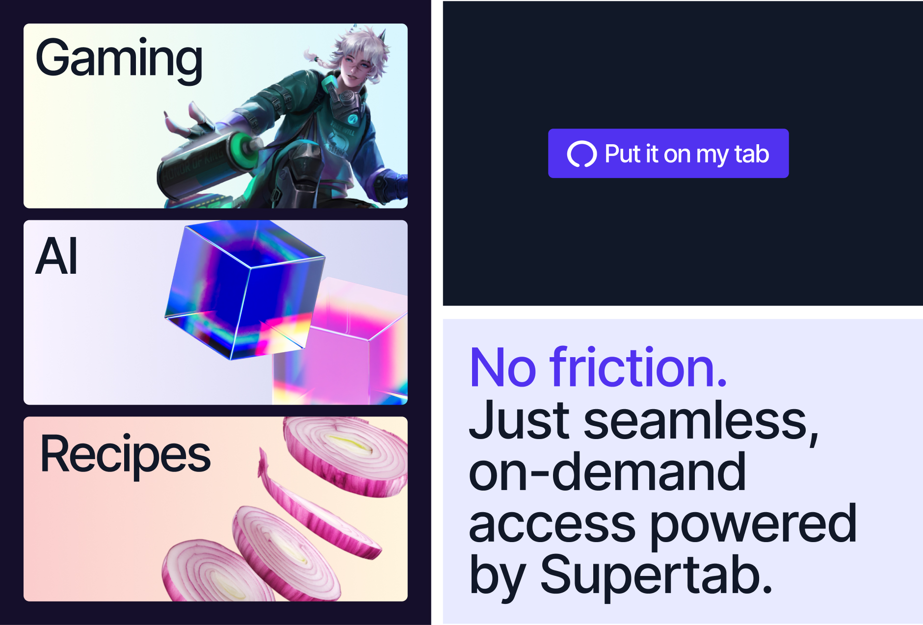
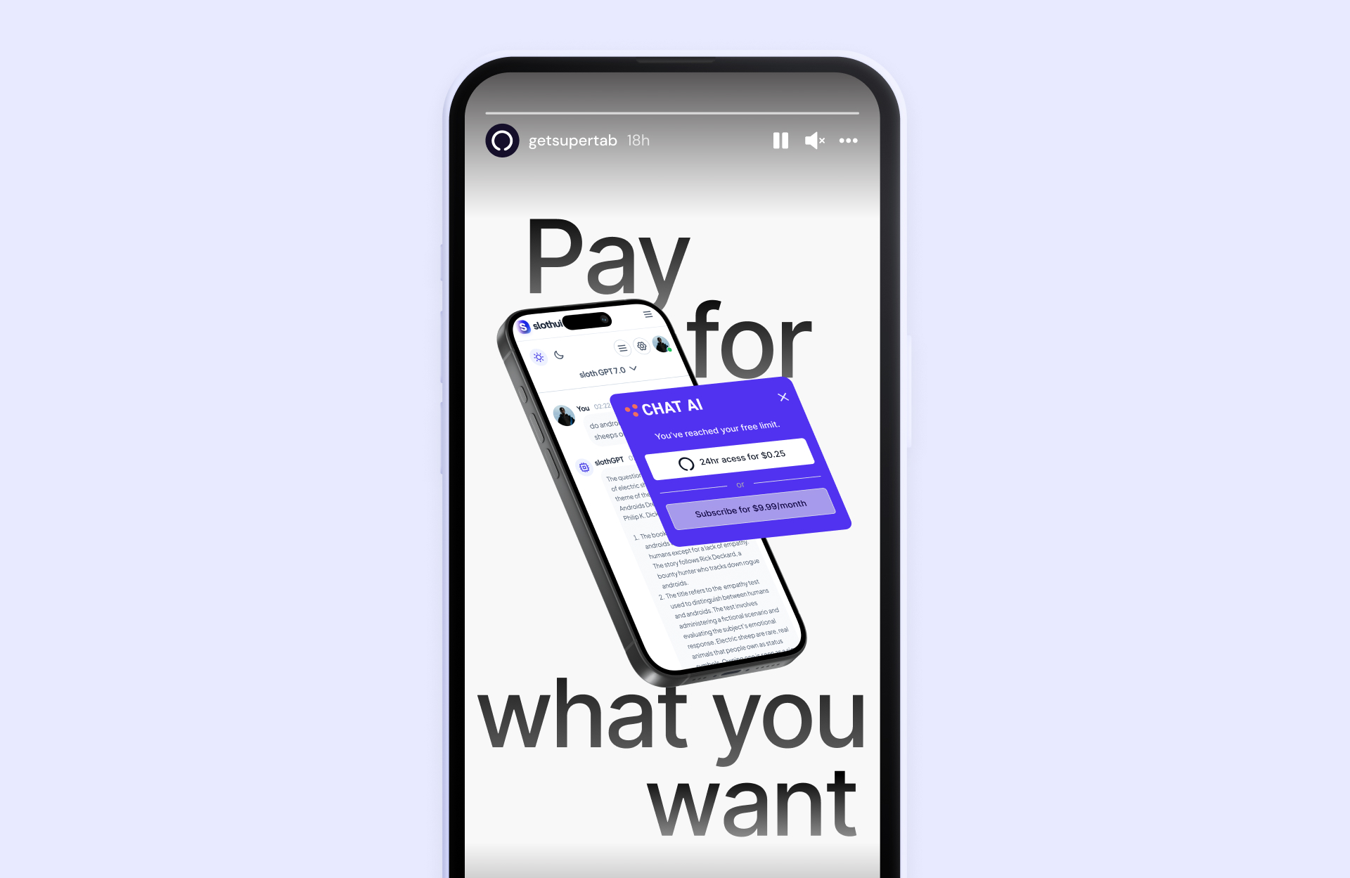
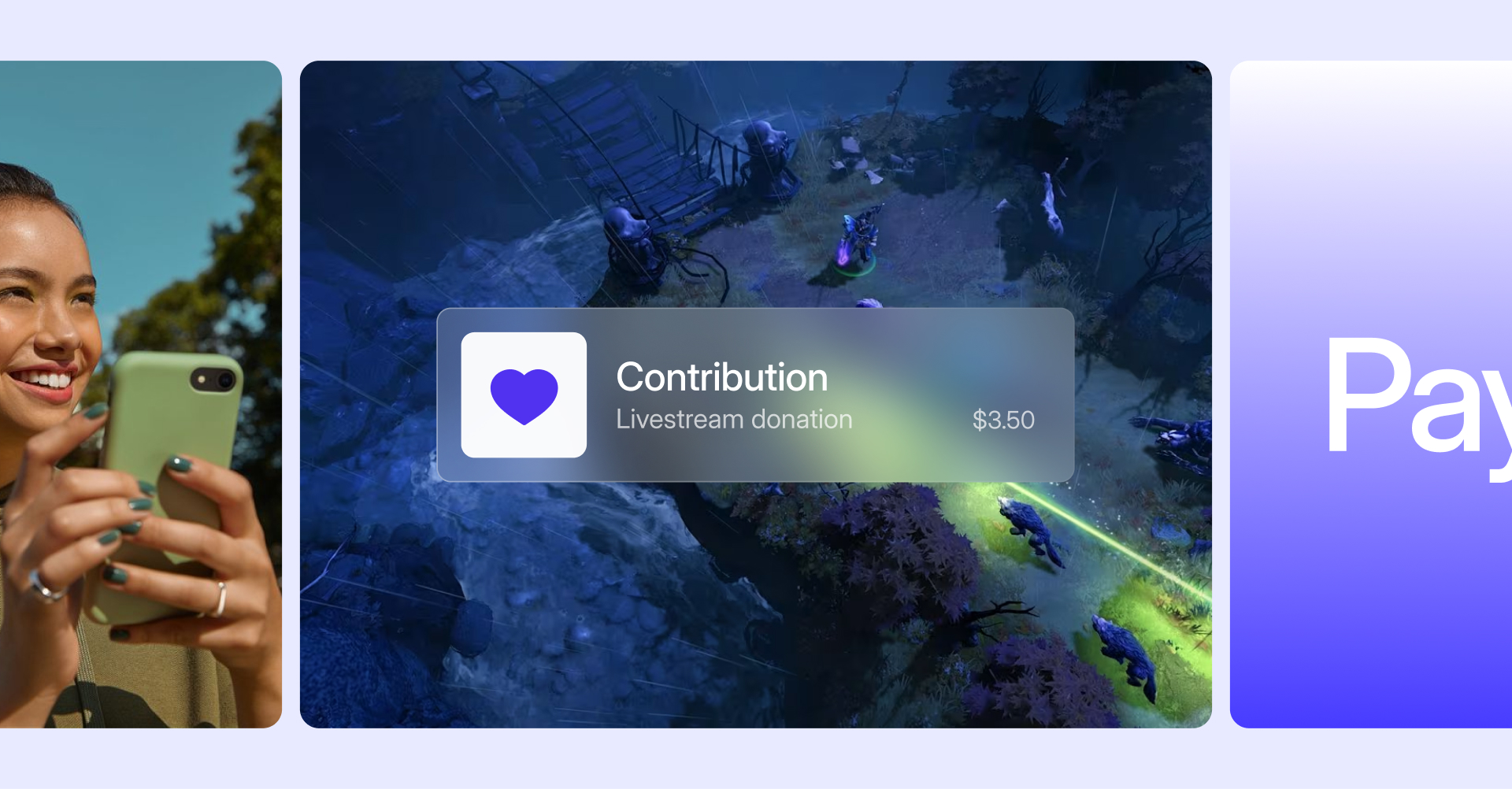
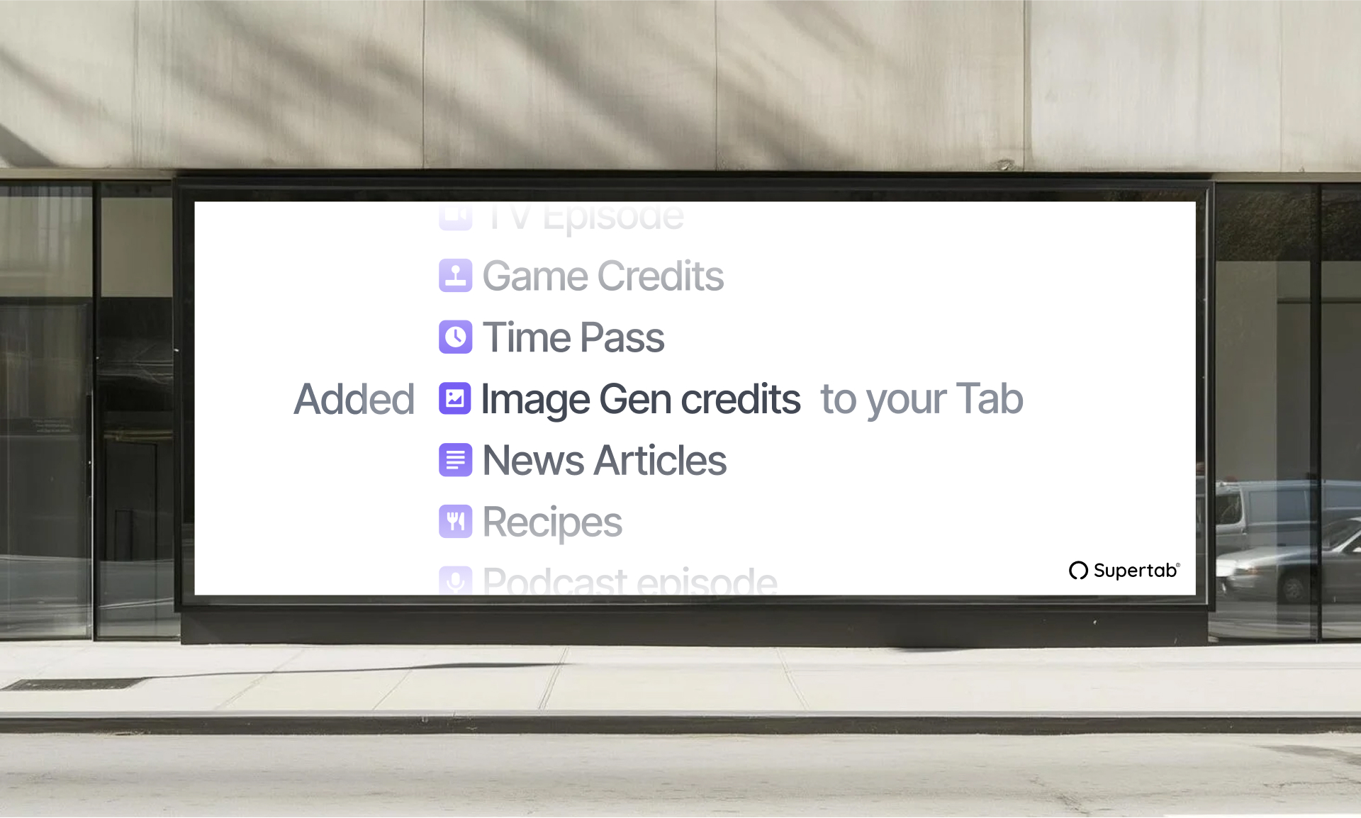
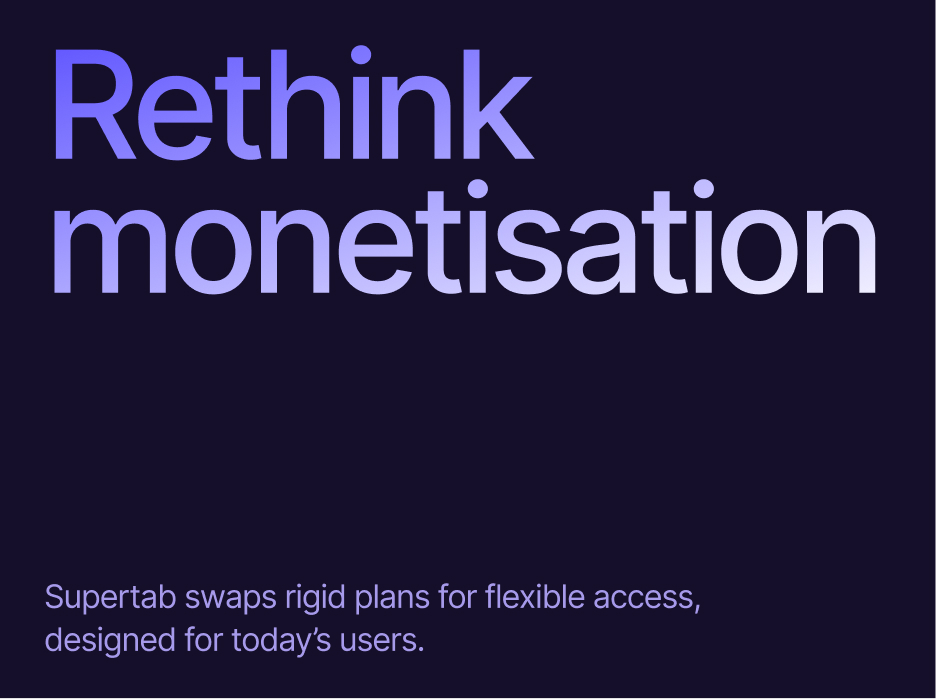
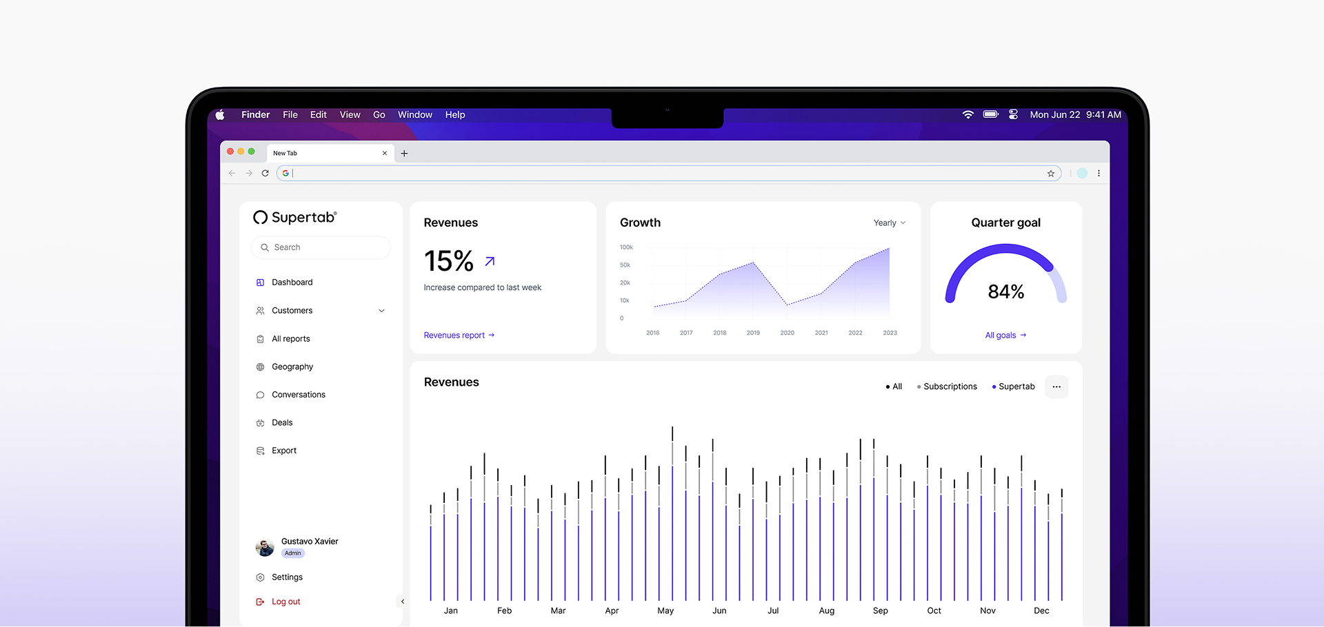
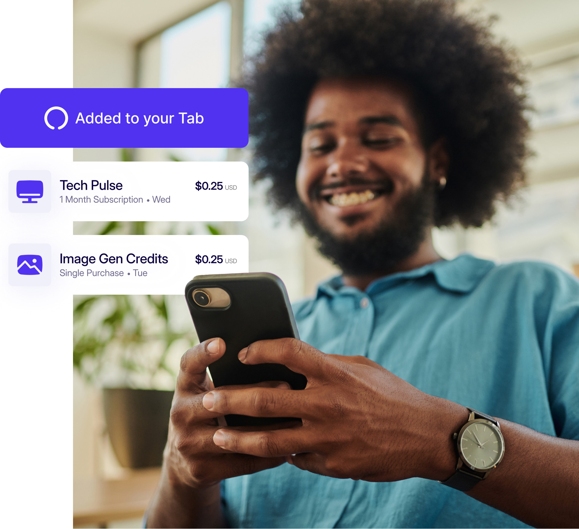
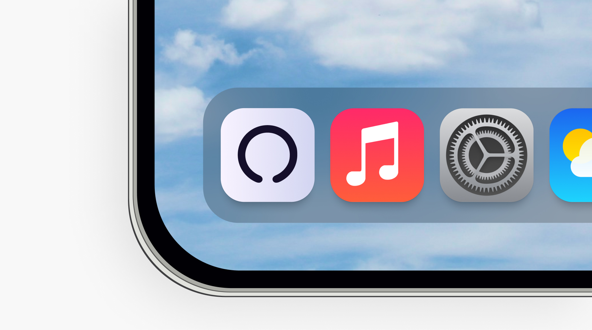
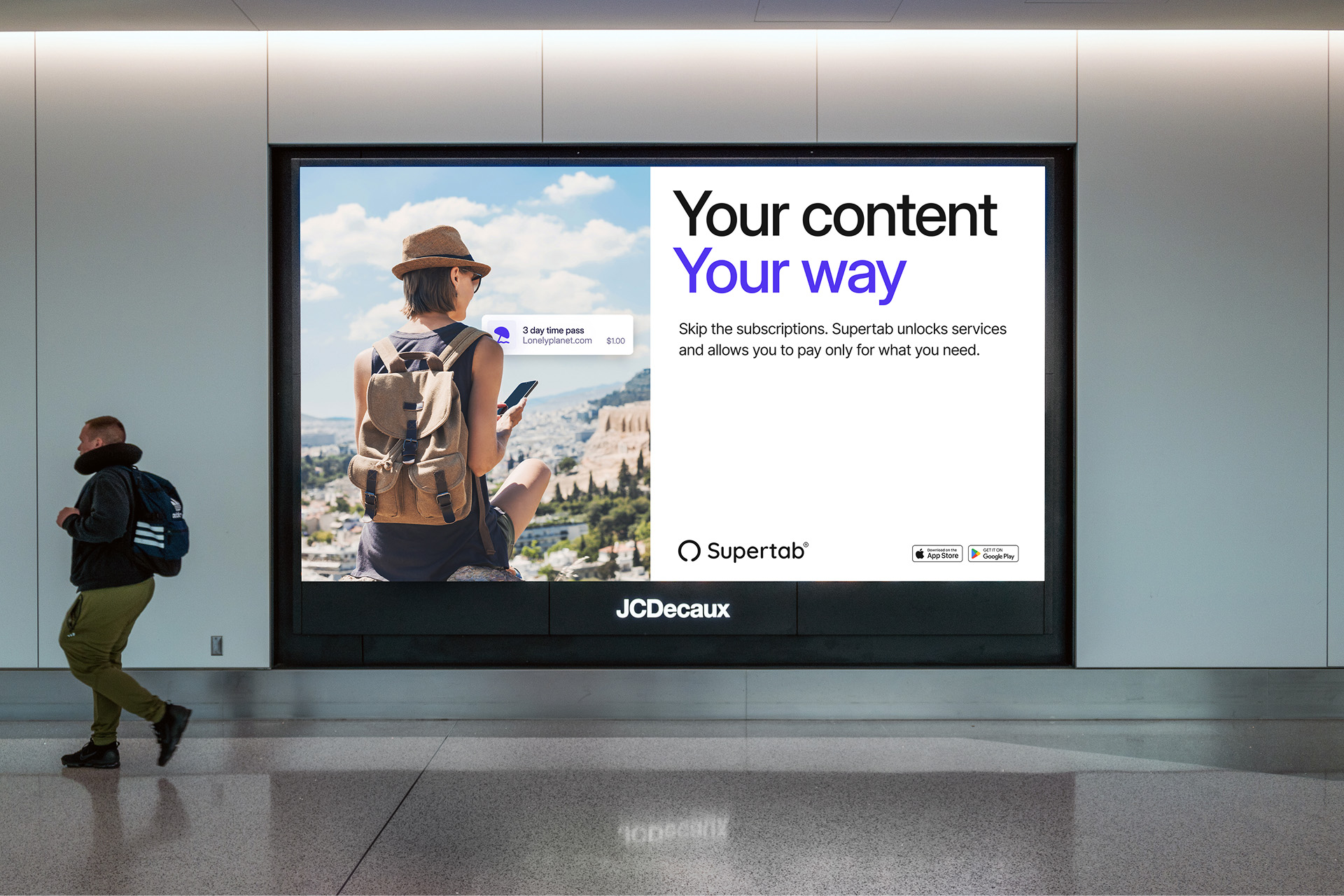
Supertab is a digital payments platform designed to make micropayments effortless for businesses and their audiences. Rapid product evolution had helped Supertab scale quickly, but it had also left the brand fragmented. Legacy elements from its time as LaterPay sat alongside newer visual decisions introduced at speed, resulting in an unclear direction for customers and internal teams alike. We were brought in to formalise Supertab’s core brand elements and create a coherent system that could support growth. Our solution focused on clarity and function: clean, confident layouts, punchy and accessible copy, a scalable typographic system optimised for digital environments, and the confident cementing of Supertab’s core colour palette. The outcome is a streamlined brand that reflects the product’s promise of simplicity, strengthening recognition, improving usability across platforms, and giving the team a clear, consistent foundation to build from.
Scope of work
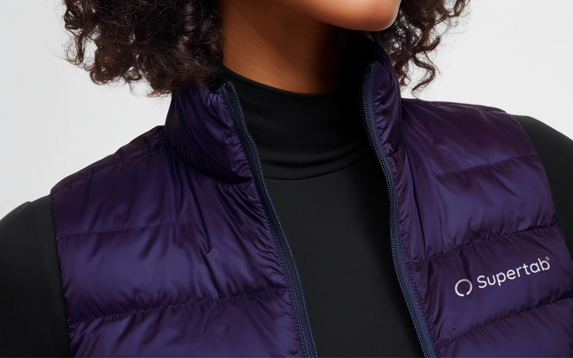
Visual identity, web design, motion design, merchandise, out-of-home, iconography, presentation design, brand guidelines


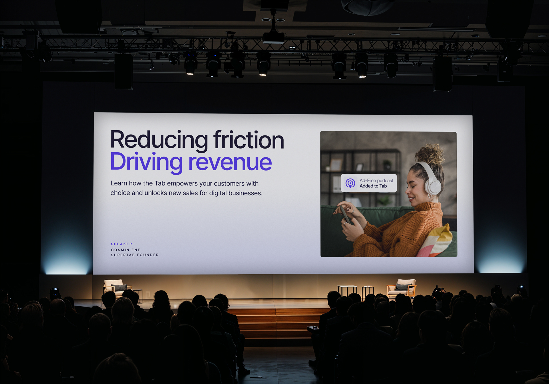

Cosmin Ene
Founder & CEO, Supertab